Branding themes
 Updated
by Lorena
Updated
by Lorena
Along with the go-live of our new customer journeys and journey builder, we also launched a new tool in Studio called the Branding Theme Builder. This guide explains how the tool works and how you can configure a branding theme according to your corporate identity.
Branding Themes
How to access
The Branding Theme Builder can be accessed by navigating to Studio → Customize → Branding.
General
The Branding Theme Builder allows the creation of one or multiple branding themes (colors, buttons, fonts. etc.) that can be applied to customer-facing booking journeys like the new appointment customer booking journeys to ensure brand control and consistency.
When navigating to Branding, you will see the overview page with the button"Create New Branding Theme" and cards of all the existing branding themes. Unlike the journey builder, there are no draft or live versions of branding themes. Once it has been applied to an artifact like the customer booking journey, the theme cannot be deleted (a new theme has to be applied first) and all edits to a theme will be reflected in the live journeys immediately after saving.
Creating and managing branding themes
- Create a new branding theme
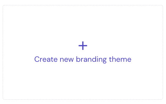
- On the overview page, click on the 'Create New branding theme' button as shown below to create a new branding theme.
- Enter a descriptive name for the branding theme in the dialog box that pops up.
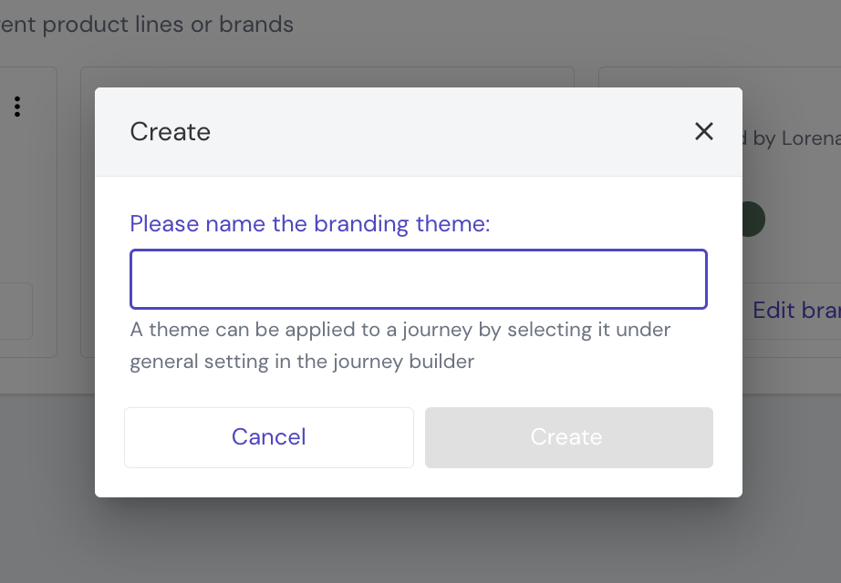
- Click on the "Create" button. The theme will be created and added to the overview page. Now, you can edit the theme.
- On the overview page, click on the 'Create New branding theme' button as shown below to create a new branding theme.
- Edit an existing branding theme
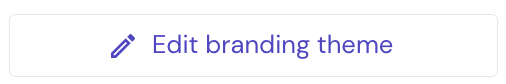
- On the overview page, click on the 'Edit branding theme' button on the card of the theme that you want to edit.
- The editor now opens. You can edit colors, fonts, button styles, and logos.
- After editing, you can save your changes by clicking on the "Save" button in the editor’s top left corner. When saved successfully a notification message will be shown on screen.
You can exit the editor by clicking on ‘Exit’ in the top left. It will prompt you to save the changes.
- On the overview page, click on the 'Edit branding theme' button on the card of the theme that you want to edit.
- Delete a branding theme
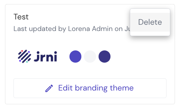
- Click on the three-dots menu in the top right corner of the card to see the menu options. Click on ‘Delete’ to delete the draft.
- A dialog box will prompt you to confirm you want to delete the theme. If done so, a notification message will appear on the screen to confirm the deletion was successful.
- Click on the three-dots menu in the top right corner of the card to see the menu options. Click on ‘Delete’ to delete the draft.
Colors
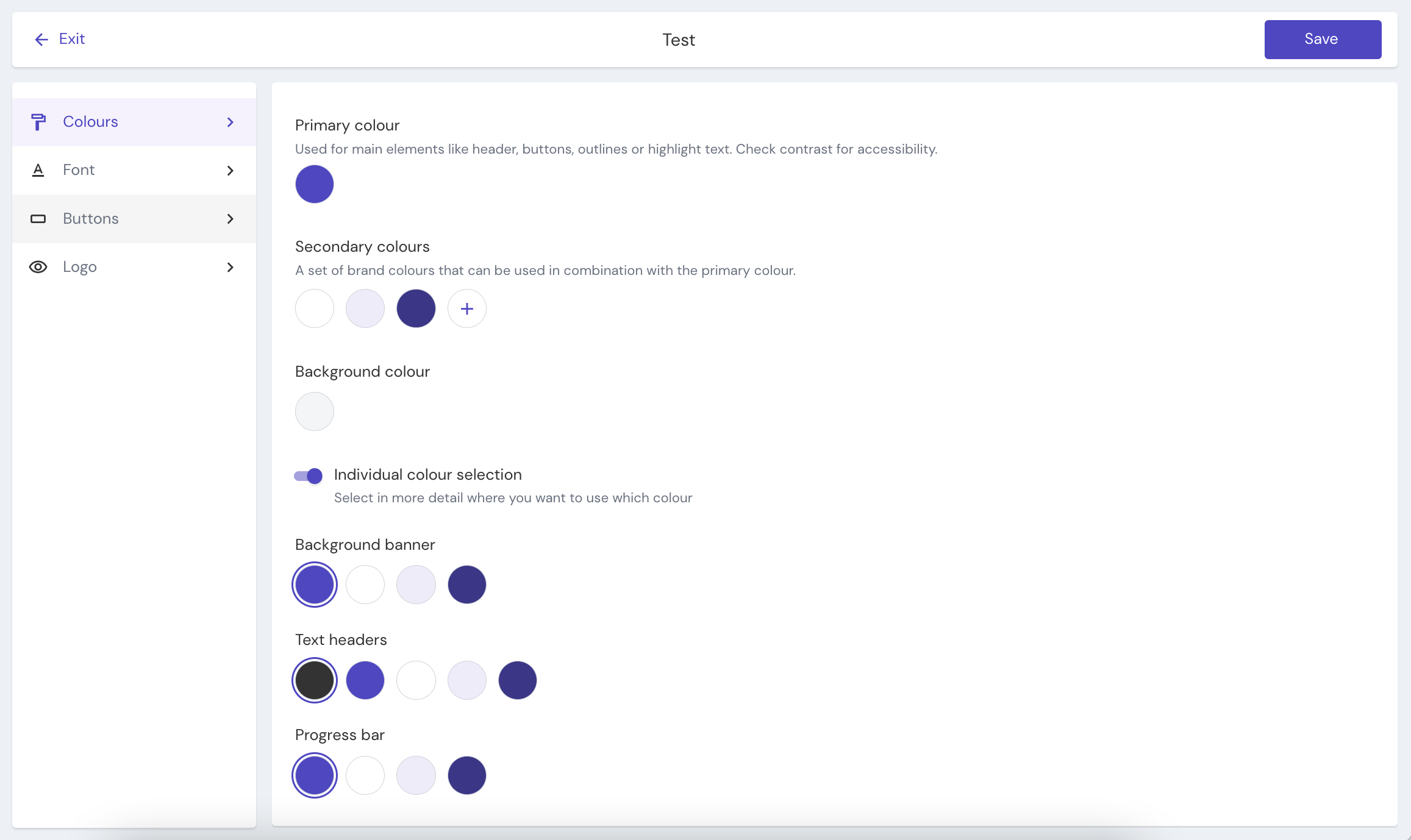
Primary color
The primary color is used for main elements like headers, buttons, outlines, or highlight text. If a branding theme was applied to a customer journey, you can open the preview to see in detail where the primary color has been applied. It can be changed to any color by clicking on the circle.
Secondary colors
Optionally add secondary colors which can be used under the individual color selection for specific components of the appointment booking journeys.
By default you will see two colors (White and a color consisting of 10% opacity of the current primary color) pre-selected which cannot be deleted or edited as they are used as system colors across different areas of the UI. You can add multiple new secondary colors to this, by clicking on the plus button.
Background color
This allows you to change the background color used for all booking journeys, by default it is set to a light grey.
Individual color selection
When toggled on, this section allows you to apply any of the secondary colors, or the primary color that you have set above, to specific elements in the UI (background banner, text header, progress bar). This allows for more granular customization. By default, the primary color will be applied to all elements (except for text which will be a dark grey).
Fonts
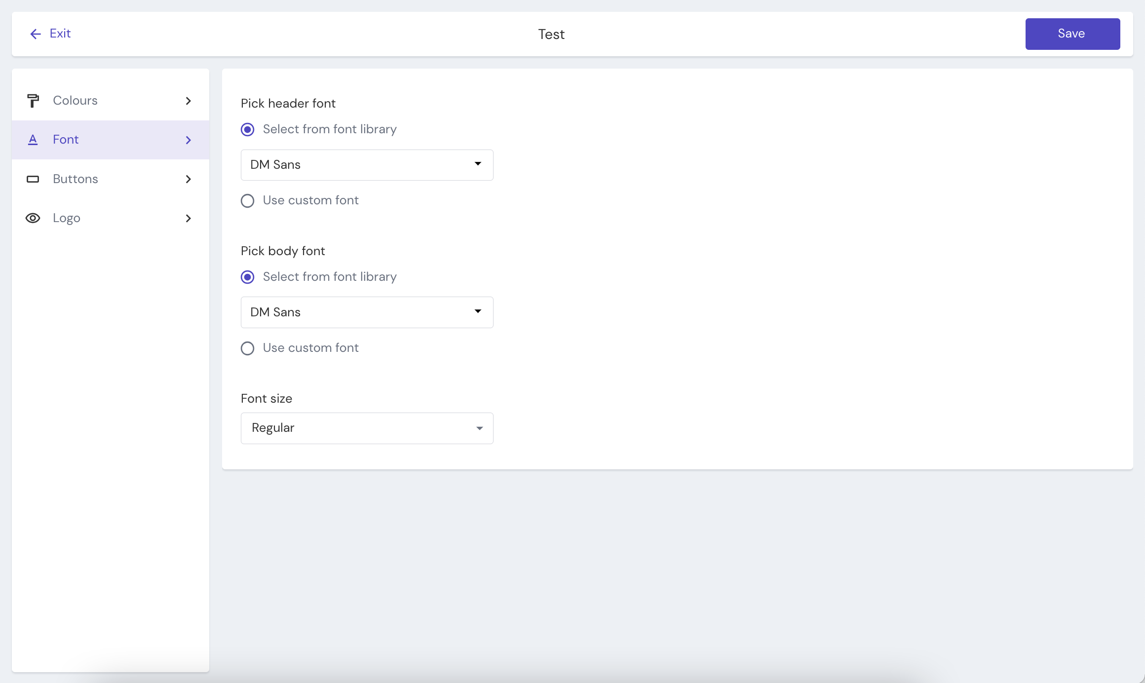
In the fonts section, you have the ability to pick a different font for headers and body text. Choose from a list of Google fonts or upload your own font (Single font file e.g. Arial regular. Supported formats: ttf, otf).
You can select between small, regular, or large font sizes, we have ensured accessibility!
Buttons
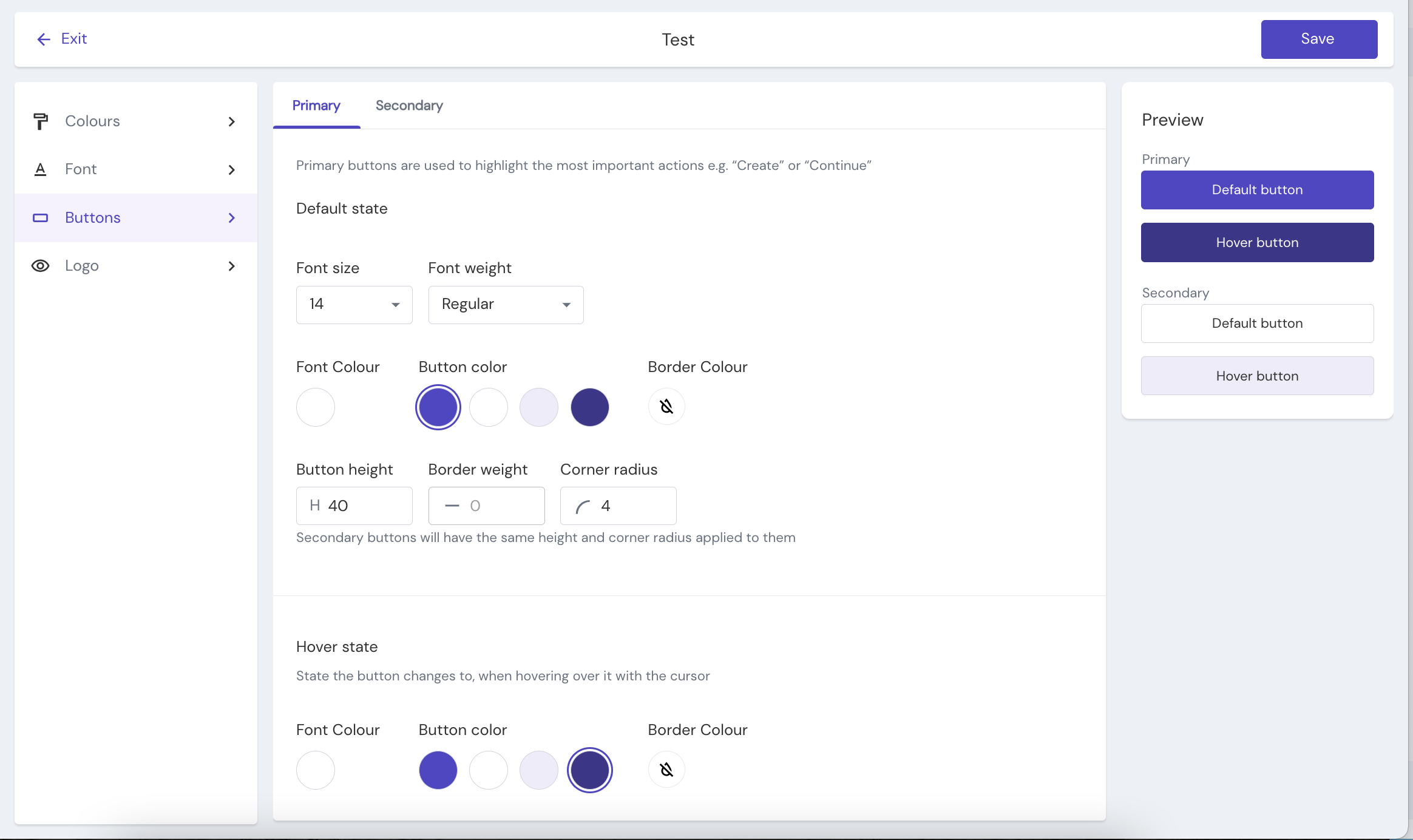
In the button section, you can edit the primary and secondary button styles and preview them in the sidebar.
Primary buttons are used for primary actions and are designed to draw the user's attention e.g. "Book, Create, Confirm". Secondary buttons offer an alternative to the primary action, so they are given less visual emphasis e.g. "Cancel, Go back".
In the default state tab, you can define the default style for the Primary or Secondary buttons including font size, font weight, font color, button color, border color, etc.
In the hover state tab, you can define how the style of a button changes when the user hovers over a button with their cursor.
Logos
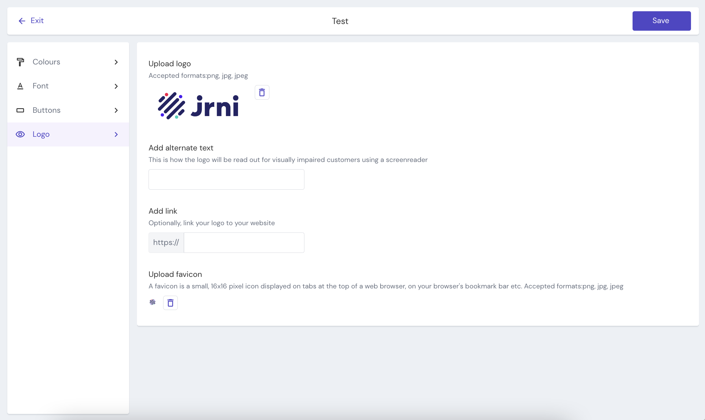
Logo
Here you can upload an image of your main logo (Accepted formats: png, jpg, jpeg)
Alternate text
This is how the logo will be read out for visually impaired customers using a screenreader, normally you would insert your company or brand name here.
Logo link
Optionally link your logo to your website.
Favicon
A favicon is a small, 16x16 pixel icon displayed on tabs at the top of a web browser, on your browser's bookmark bar, etc. (Accepted formats:png, jpg, jpeg)
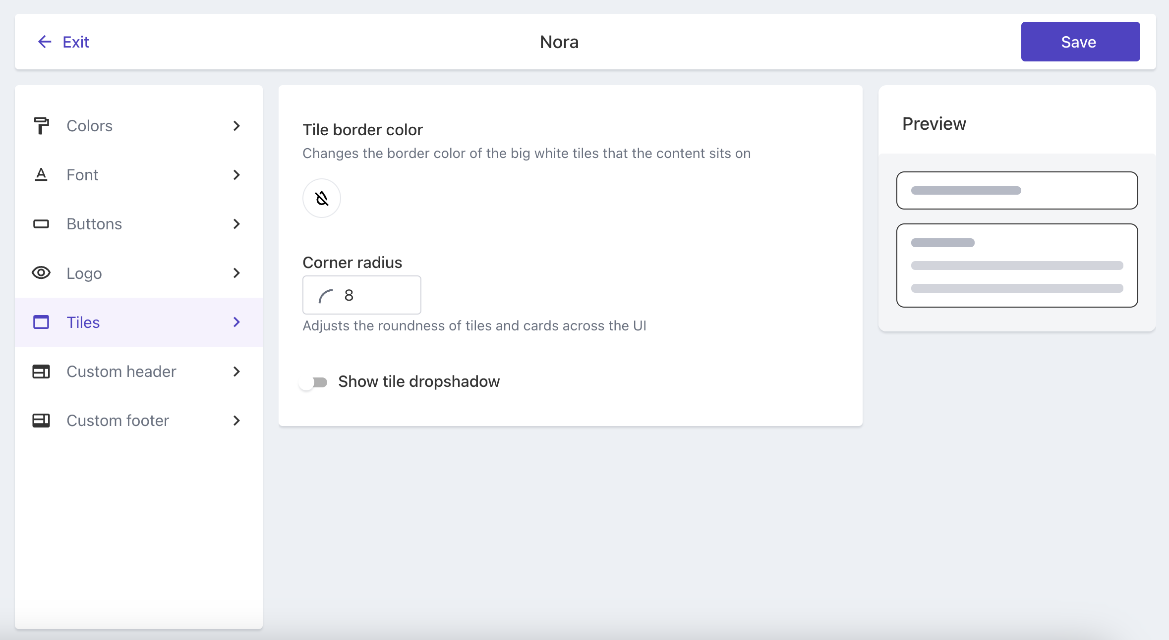
Tiles
Tiles are the big (by default) white tiles that all the contents sits on in the customer booking journeys. This section allows you to change the colour, adjust the roundness of their corners and add or hide a dropsahdow to them - so the journey fit seamlessly into your company's branding/web styles.
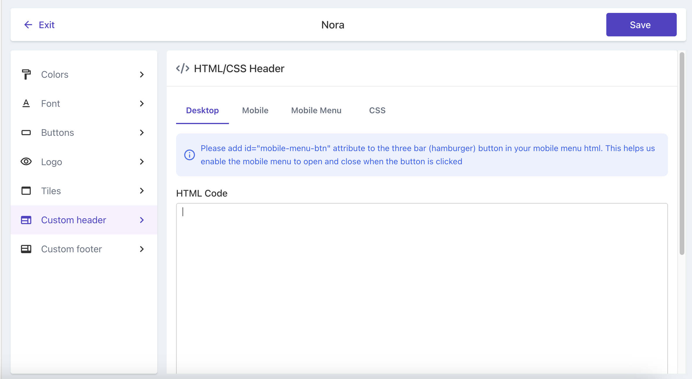
Custom Header/Footer
Under custom header/footer - you can insert your own html code to add a personal header or footer to the journeys. Like this you have full control over header and footer branding and can match it to your companys website. There is a separate tab to insert styling for mobile phones and CSS.
Since on mobile we only show the logo, language selector and the mobile menu , you can also add code for the styling of the expanded mobile menu drawer.
Related articles
Still have questions?
If you have any further questions about the new customer booking journey, please contact JRNI Customer Support, who will be happy to help.